Marku Machining — Brand Identity & Visual Communication Refresh
Marku Machining came to me with a logo, a YouTube channel full of machining videos, and… not much else.
The branding felt outdated, think early 2000s HTML site vibes, and there was no clear visual identity tying anything together.
My goal was to give the company a clean, modern facelift that reflects their professionalism and high-quality work.
This meant rebranding their logo, creating consistent visuals across business cards, social media, and video content, and establishing a posting plan to keep their audience engaged. Alongside the design work, I also took on the role of managing their online presence across LinkedIn, Facebook, YouTube, and Instagram.
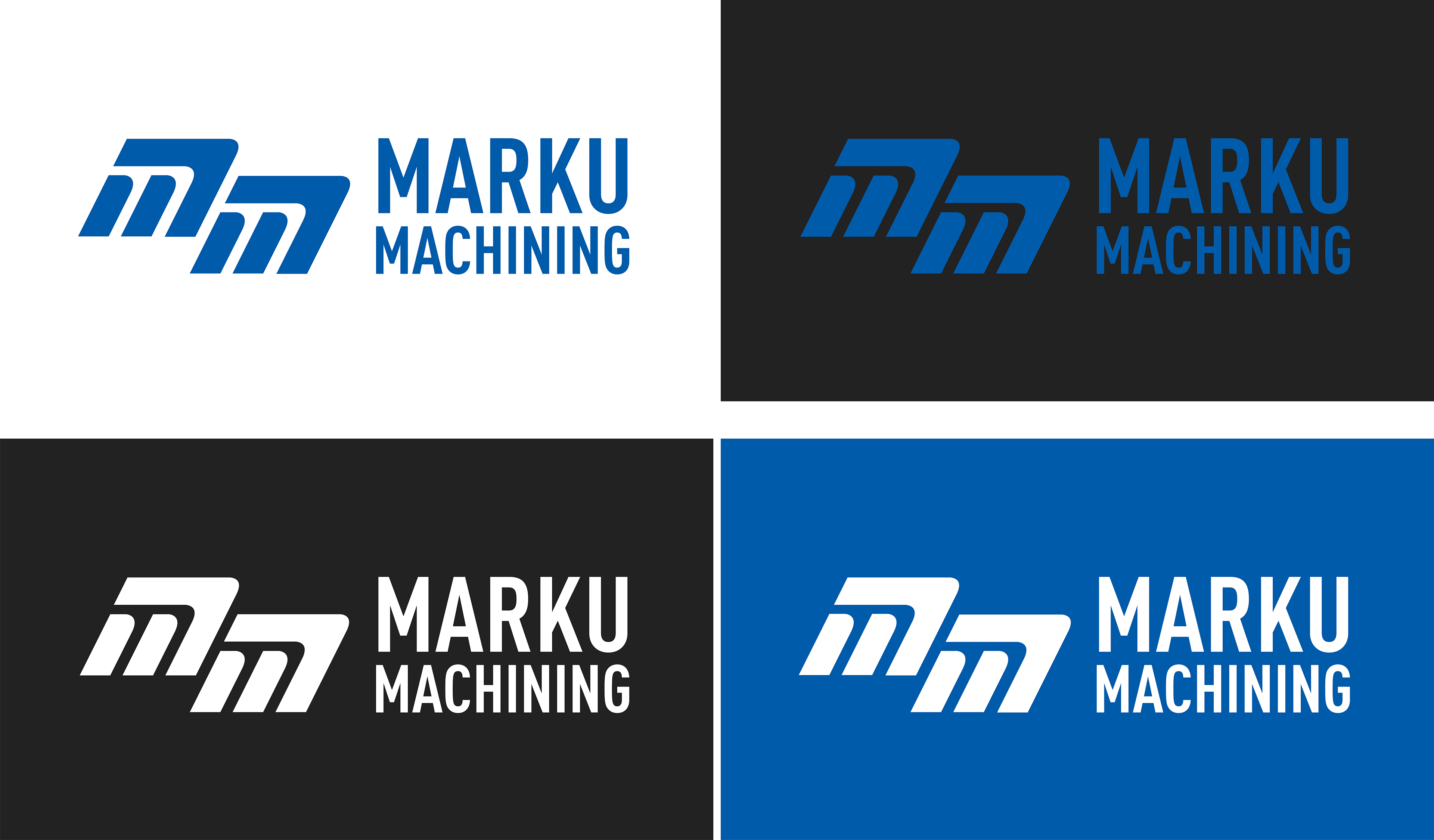
The first thing I did when I arrived is that I redesigned their logo from a "2000's HTML" style to a more professional and minimalistic styling which will garners more respect from the previous logo.
The goal of animating the logo is to give it a usability in videos on Youtube, Instagram, Facebook and LinkedIn.
I also rebranded their business cards using new branding guides which I've made and their corresponding colors.
Which including the amount of information they have still is readable in a normal setting.
Which including the amount of information they have still is readable in a normal setting.
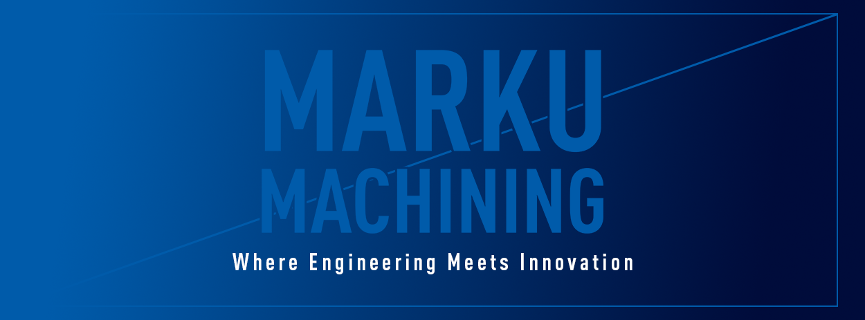

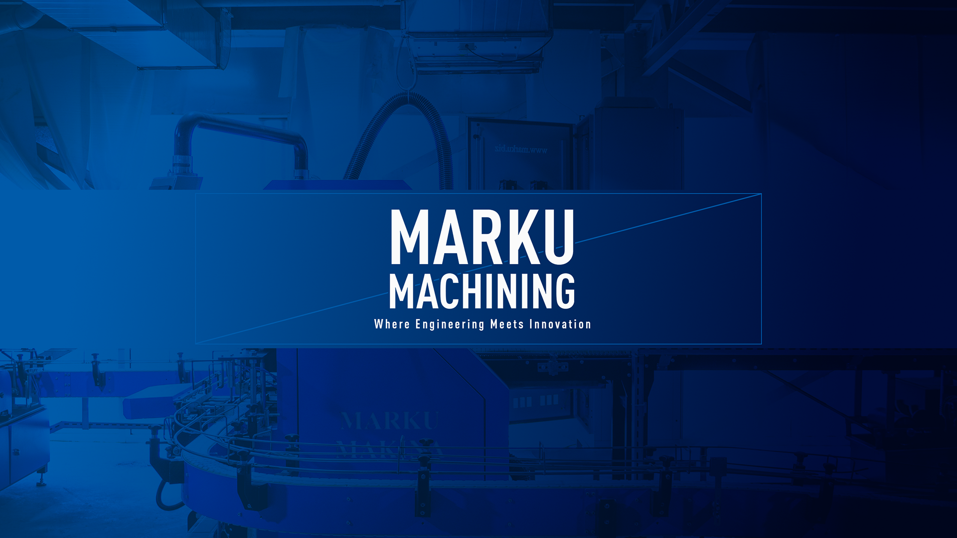
YouTube banner. LinkedIn banner. Facebook banner.
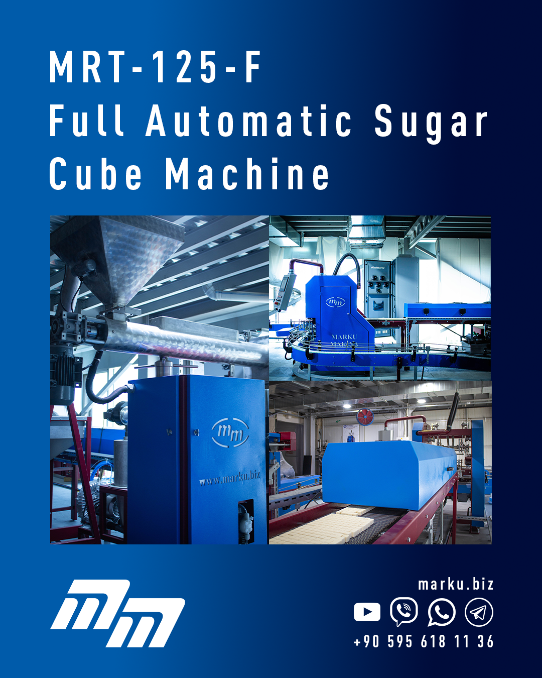
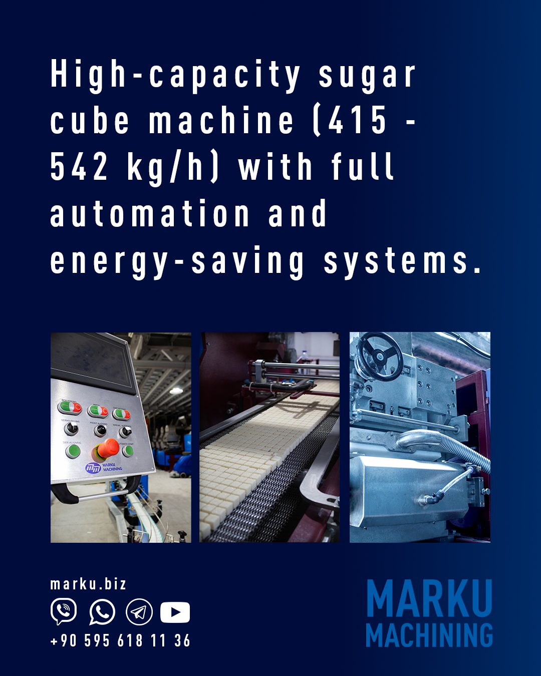
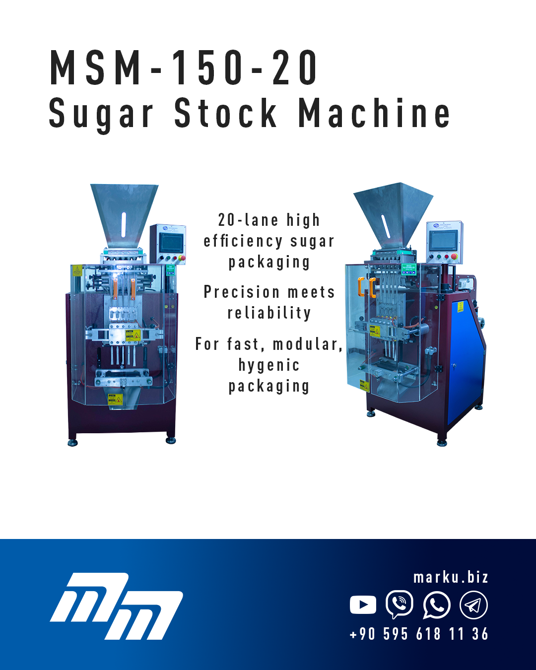
Instagram/Facebook/LinkedIn posts design.
Photography has also been done by me.
Photography has also been done by me.
